How do I create week-over-week and month-over-month comparisons in analytics?
Last updated: November 4, 2024
Pylon's analytics dashboard allows you to create custom graphs to compare your support metrics over different time periods, including week-over-week (WoW) and month-over-month (MoM) comparisons. Here's how to set this up:
Steps to Create Comparative Graphs
Navigate to the Analytics section in your Pylon dashboard.
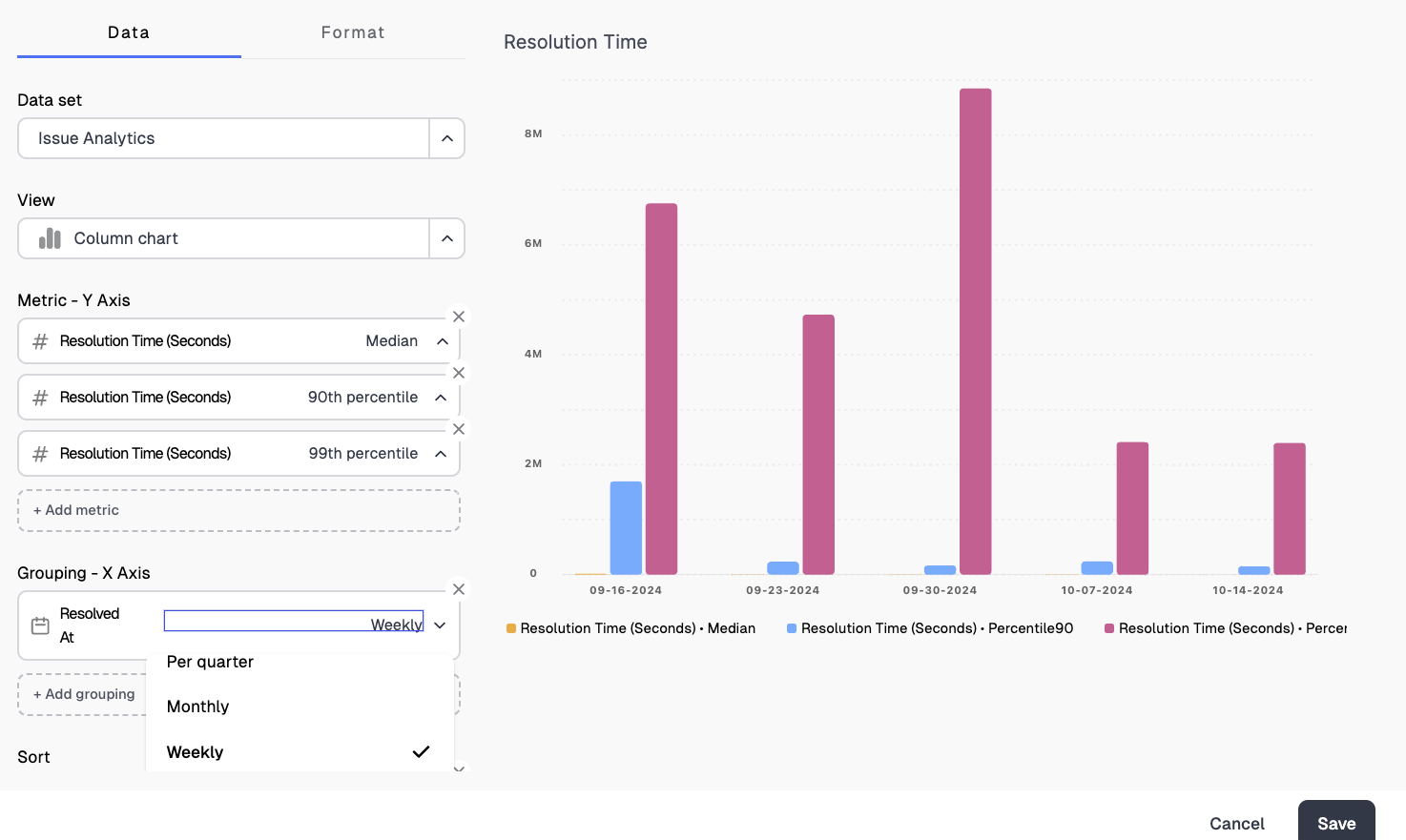
Select a templated graph that's relevant to the metrics you want to compare (e.g., Resolution Time, First Response Time).
Click on the graph to open the customization options.
In the data section, adjust the time period to suit your needs:
For WoW comparison, set the time period to "Less than 14 days"
For MoM comparison, set the time period to "Less than 30 days" or "Less than 60 days" depending on how many months you want to compare
Use the "Group by" option to segment your data by week or month.
Adjust other settings as needed, such as the metrics displayed (median, 90th percentile, etc.) and the chart type.
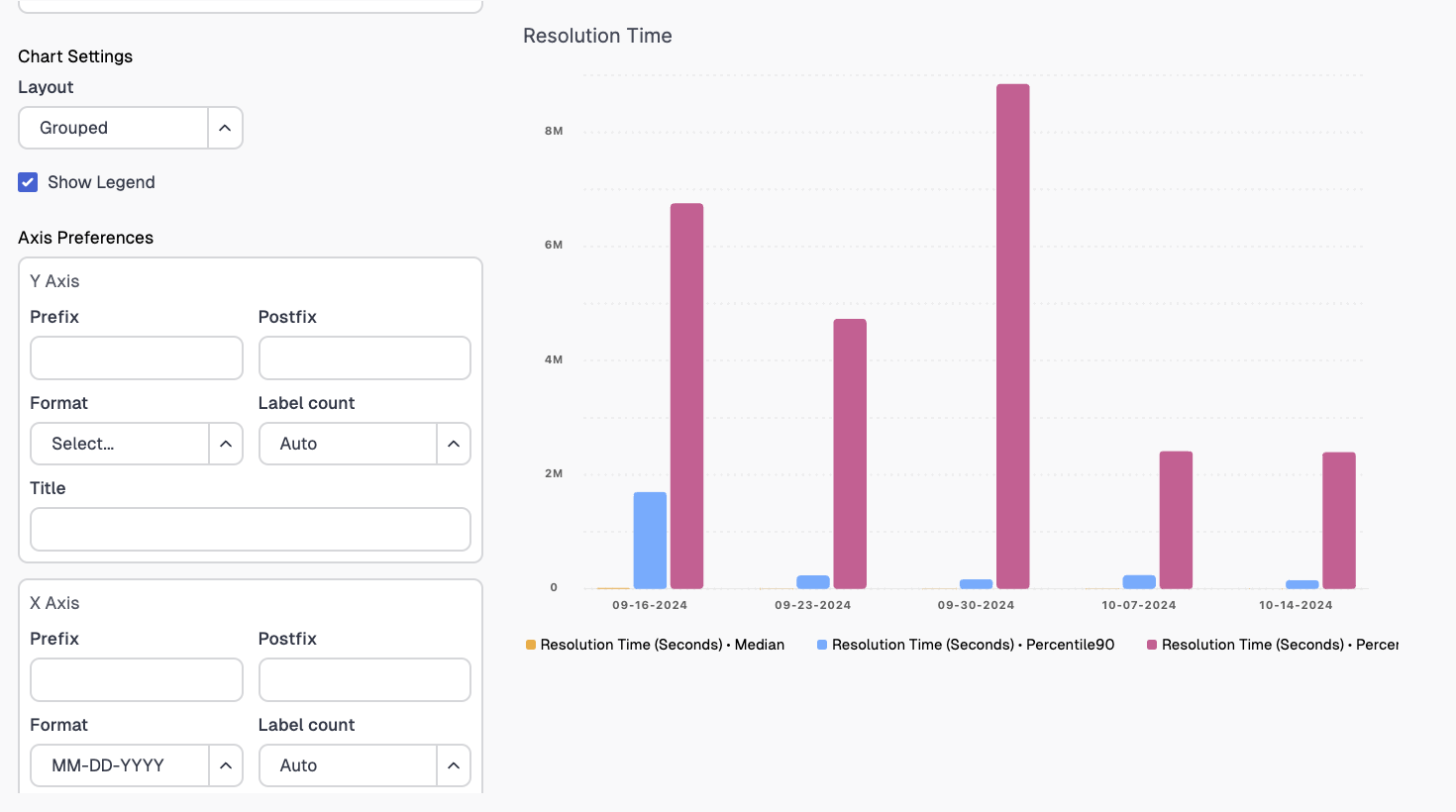
Customizing Your Graph
You can further customize your graph using the following options:
Data: Choose the metrics you want to display (e.g., median, 90th percentile, 99th percentile)
Format: Select the chart type (e.g., column, line) that best represents your data
Layout: Adjust the overall appearance of your graph
Axis: Modify the scale and labels of your axes
Title: Give your graph a descriptive title
Tips for Effective Comparisons
Use consistent time periods for accurate comparisons (e.g., always compare full weeks or full months)
Consider using percentiles (like 90th percentile) in addition to averages to get a more complete picture of your performance
Export data to Excel for more advanced analysis if needed
By following these steps, you can create insightful WoW and MoM comparisons to track your support team's performance over time and identify trends or improvements in your metrics.